
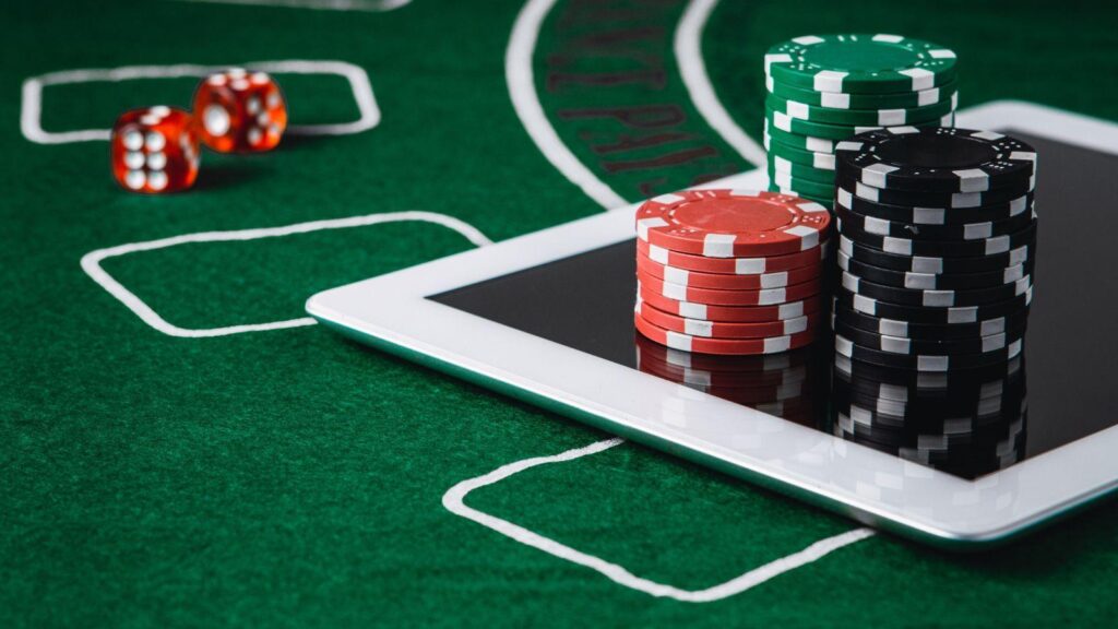
Digital games can feel confusing before the game even starts.
You open a screen and see five buttons, three glowing icons, a timer, a menu, and one tiny symbol that seems important but gives you no clue. Your eye jumps around. You tap the wrong thing. The game may be good, but the first few seconds already feel messy.
Craft makers know that feeling too. A sewing pattern with unclear marks can slow the whole project. A crochet chart with tiny symbols can make a simple row feel harder than it is. The idea might be lovely. The yarn might be perfect. Still, if the cues are unclear, your hands hesitate.
Digital game design works much the same way. Color, repetition, texture, symbols, and layout tell the player where to look first.
Color points the eye
Color is one of the quickest signals on a screen.
A bright button says “tap me.” A red marker says “careful.” A soft gray panel usually tells the eye, “this is background stuff.” Visual hierarchy uses things like color, contrast, scale, and grouping to guide attention. Games lean on that constantly.
Craft projects do it too, just with thread, yarn, paper, or beads. A red stitch marker in pale yarn stands out. A darker thread can mark an edge. A repeating color block shows where the pattern shifts.
In online casino design, puzzle games, and mobile menus, color can help or it can shout too much. When every button glows, nothing feels important. One or two strong colors usually do more than a whole rainbow fighting for the same inch of screen.
Repetition makes things feel familiar
It has a calming effect when it is used well.
In knitting, repeated stitches create rhythm. In paper crafts, repeated shapes make the piece feel balanced. After a while, you know what comes next and your hands settle into it. Almost.
Games use the same idea. The same icon appears in the same place. A tap gets the same sound. A menu behaves like the last menu. That design rhythm builds visual clarity without making the player stop and think too much.
This matters in themed game design. A game can use gems, cards, fruit, coins, or fantasy symbols, but the player still needs to know what is decoration and what does something.
Visual feedback helps. A button changes shade after a tap. A symbol lights up when it matters. A completed step gets a small animation. Not fireworks. Just enough of a nod.
Rules need a visible place
Screen design does more than just making a game “pretty”. It also helps users see where they are, what they can do, and what they should check before using a platform. This becomes more important around regional online gaming rules, regional restrictions, safe online gaming access, and platform transparency.
In the UAE, the GCGRA states that commercial gaming must be licensed by the authority, and unlicensed commercial gaming activity is illegal. So when someone looks into digital entertainment platforms like a legal casino in UAE, the basic information should not be buried. Rules, terms, responsible gaming design, and trust signals need to sit where people can actually find them.
It is not the glamorous part of interface layout. It is more like labeling boxes before starting a craft project. Dull for five minutes, useful for weeks.
Symbols should be clear, not clever
Icon design can make a screen feel simple or oddly tiring.
A gear for settings works because people know it. A house for home works. A lock for account safety works. Once icons get too clever, users have to pause and guess.
That guessing is friction.
Craft patterns have the same problem. A clear symbol chart helps. A strange symbol with no key makes people squint, count again, and maybe mutter at the table. I have done that with badly printed instructions. Not proud, but there it is.
Clear symbols support user confidence. They help with simple navigation, payment areas, settings, rewards, and account tools. A beautiful icon nobody understands is just decoration in a tiny costume.
Layout decides how calm the screen feels
Screen layout controls the mood more than people notice.
A neat layout gives the eye a path. The main action sits where it should. Extra details do not fight it. The screen has a bit of breathing room.
That matters in casino game interfaces, mobile games, and other online gaming platforms where users may only have a short session. If the screen feels crowded, people slow down. If the user flow is clear, they move through without thinking about every tap.
In cooking, this is called “mise-en-place”. In crafting it’s often referred to as “setting your layout”. Whichever the case, it can make an overwhelming project feel much calmer and organized.
Tiny choices carry the whole thing
Most visual design in games works quietly.
Players may not notice the spacing between buttons, the repeated icon, the color contrast, or the small glow after a tap. They just feel that the game is easier to follow. Or they feel the opposite and leave.
Craft-inspired design works like that as well. A good pattern does not keep announcing how clear it is. It simply lets you keep going.
A screen can be bright and still feel calm. A craft table can be messy and still make sense. As long as things are where you expect them to be.